Written by: Yohanna Carmona, Graphic Designer at Datalytics
I found myself facing a completely new world, learning tools I didn’t know —like MicroStrategy and Power BI—and working with people who, for the most part, were engineers with very different perspectives on design.
When I first got into Datalytics, I was in my ninth semester of my graphic design career, and I was looking for my business practices. Most of my classmates were dreaming of doing their practices in agencies, universities or large companies to stand out with their illustrations in advertising campaigns, digital marketing and so on.
And there I was, arriving at Datalytics for the selection process interview, with no prior work experience in the field of graphic design. I was nervous about facing this new stage of my professional life and the only thing I knew was that I was going to develop infographics. When I got in, I learned more about the functions of my role in the field of data engineering, and from that moment on, I fell in love with my job and Datalytics.
My first day of work was a big challenge. I found myself facing a completely new world, learning tools I didn’t know —like MicroStrategy and Power BI—and working with people who, for the most part, were engineers with very different perspectives on design.
Initially, I had to make a design scope for these tools, which consisted of exploring them through graphic elements: which typographies they had, whether I could install new ones, how to load images and in what formats, the application of colors and all the other elements.
It was quite complex as compared to design tools, they were very limited. For me, everything was really new and my colleagues explained to me what they did and the process they had to reach a final dashboard.
✨ “Make your magic!” is what they always tell me at Datalytics after making a request to the design area. People complete a form in which they describe what they need for their projects, and then they share the initial dashboard with me.
My main objective is to improve the appearance of the dashboards, which is achieved by conducting previous research on the customer/brand, looking for references, choosing the correct graph and layout, and applying colors, typographies, shapes, textures, spaces, images and sizes for the big transformation.

Tips for achieving effective data visualization
From these experiences working with these tools and what I’ve experienced so far, I’ve learned that:
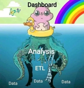
- The process is just as important as the result: data + visualization is the perfect combination. Data is our fundamental base, but we also have to take into account the aesthetic side as a complement, which is what invites us to interact with data, understand it correctly and, above all, use it. 😎
- Everything is designed: tools and materials will always have limitations to create or transform, however, that can’t be an obstacle. The key is to face the challenges with the tools and knowledge we have.
What role does graphic design play in the world of data & analytics?
- The application of design to data visualization helps visually attract users, through pleasant and attractive compositions to generate a connection between data and the person who is reading or interpreting it.
- We are surrounded by data, visualization generates a transformation; it helps give an orderly shape, understand the complexity behind them, communicate stories and content, giving them visual representation to understand them better.
- Data visualizations are ideal for making decisions, exploring and interacting with data. These help us segment information, effectively highlight important statistics and have an effective presentation.
What should be taken into account to achieve effective data visualization?
- Knowing your client or user is fundamental, they are the ones who lay their cards on the table, express and transmit in detail what they have and what they need, the ideal is to have assertive communication to understand the business, know what they want to achieve and build from that. It is key that the final delivery be understandable from the visualization, that it generate connection, that it be aesthetic and functional.
- Conducting research and searching for references, this is the basis of building projects, it is the starting point, the guide for creating and applying all elements.
- Defining the appropriate graphs for the dashboard, these are selected according to the type of information we want to present, whether for comparison, relationship, distribution or composition, individually and together.
- Structuring the visual elements based on the client’s corporate manual if they have one, otherwise extracting them from the research and reference search.
- Creating a visualization guide with the selected graphic elements and applying them correctly to the chosen tool.
- Scheduling constant reviews with the client who will use the dashboard; generating new ideas and allowing for necessary improvements, evaluating the user experience until final delivery and feedback.
In the end, as they say out there, “in design, as in life, put some color.” 💃


